A logo is essentially and extension of your cheer or gymnastics brand! It gives potential customers a feeling that can stay with them throughout the decision process. In any business, a bad logo can be a make-or-break proposition. At its peak, a logo can stand alone without any corresponding text and still be iconic. Think of your favorite sneakers. My guess is if you saw just the swoosh, you’d still know what brand it is. Besides the name of the gym or business, the logo is the most distinguishable trait of any brand.
So you have your gymnastics or cheer team or group and you’re ready for a logo to be created. Awesome! Tastes in how your logo should look will vary with every person, but a good logo will resonate with everyone. Now imagine everywhere in your gym where your logo will be. Is it on the sign out front, the letterhead, wall padding, on the gym mats or uniforms? Chances are your logo will be everywhere and that’s why it’s so important!
Below are some tips to keep in mind when coming up with a concept and design of your cheer or gymnastics logo.
1) K.I.S.S. (Keep it simple, Stupid!)
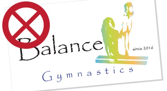
This mantra can be utilized throughout anyone’s life but even more-so in design. A simple, clean logo will get your point across much quicker than a busy cornucopia of gymnast silhouettes, cheerleading pom-poms or sparkles. Note the girl in the logo to the right. She’s balancing on a beam, did you notice that right off the bat?
2) Every shade, all the time
Too many times I’ve seen logos that look great in full color, only to get lost when printed in black and white in an ad or on a busy background. Making sure your logo is designed right the first time and in all variations should be extremely important to you and the designer. Take your logo and place it in its final form on a white background. How about a black background? What about a pattern? Does it still stand out or does it get lost in one of the iterations? Look at the logo to the right again. How would the rainbow gradient look on a busy background?
3) From billboard to business card
The point being is this – if you have super small text or a design element that is extremely busy, chances are that when it’s inevitably shrunk down, readability will be reduced and could negate visibility. Make sure your logo is readable at any size! The logo on the right has super small “since 2016” text. Would that be legible printed on a business card?
4) Color Your World
Along with your gym name and logo, color is the most recognizable part of your brand. From the gym mats to the spring floors to the uniforms or leotards, These are the colors that you could be seeing for years to come. There are sure to be colors that are hot at the moment, but thinking long-term, will those colors date your gym in 5 years? Again back to the gradient. Is this the color scheme you want representing your teams in the future?
5) Go with your gut
Everyone will have an opinion about what your logo should look like. But by following the above basics, you and your designer should be able to come up with a solid design, that everyone should like!
6) Be Fair
Logo design is difficult and it can take countless options and revisions to come to a final logo design. Without getting into specifics, leave designing your logo to the professionals. And as a skilled artist or designer, they should be compensated accordingly. Too many times I have been approached to design a logo with the promise of “exposure” or a “solid portfolio piece”. If I were to ask a gymnastics coach to teach a class for “exposure” or “it’ll look good on your resume!”, I’d get laughed out of the gym! Be kind to your designer and you could start your brand or gym with a logo you can be proud of.